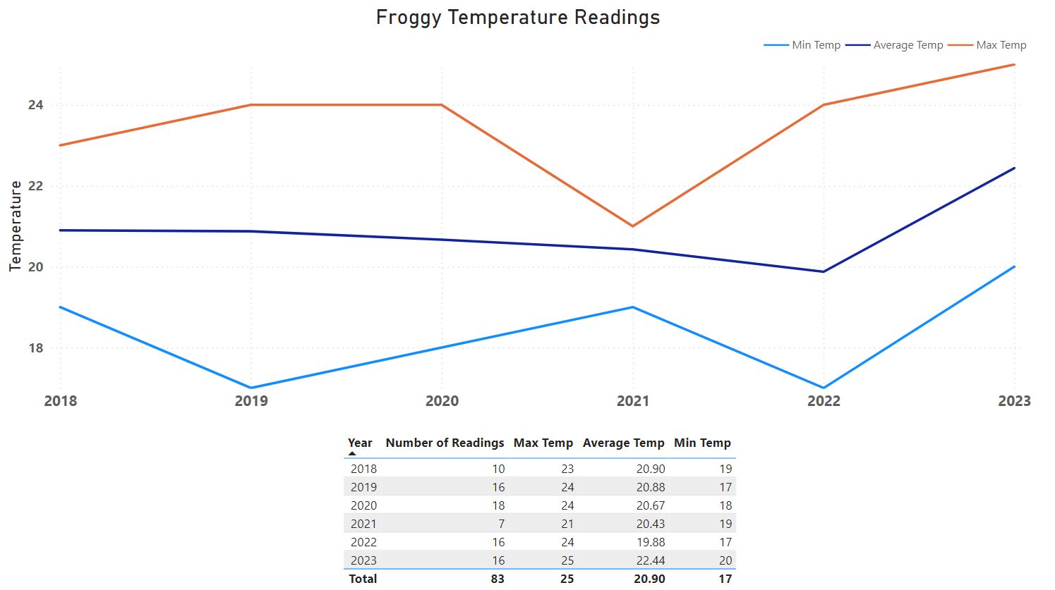
I have been gathering water temperature data for the last few years and decided to try playing with PowerBI to do some (basic and rudimentary) data visualization of water temperatures of the beaches I go to in Galicia in the summer:

More details and context
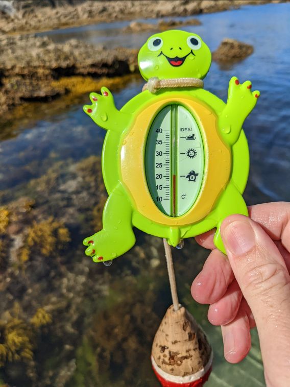
Due to the crazy tide differentials in Galicia I realized that a tool was needed to easily and quickly know the current tide situation because it determines which beaches are viable. I found a line of Timex watches that had a tide indicator and as a bonus it also had a temperature gauge. So I began getting in the habit of taking note of the water temperatures of the beaches we would go to and I have data going back to 2014. In 2018 I decided to upgrade to a more scientific instrument and invested in a Reer 2499 and modified it with a flotation device:

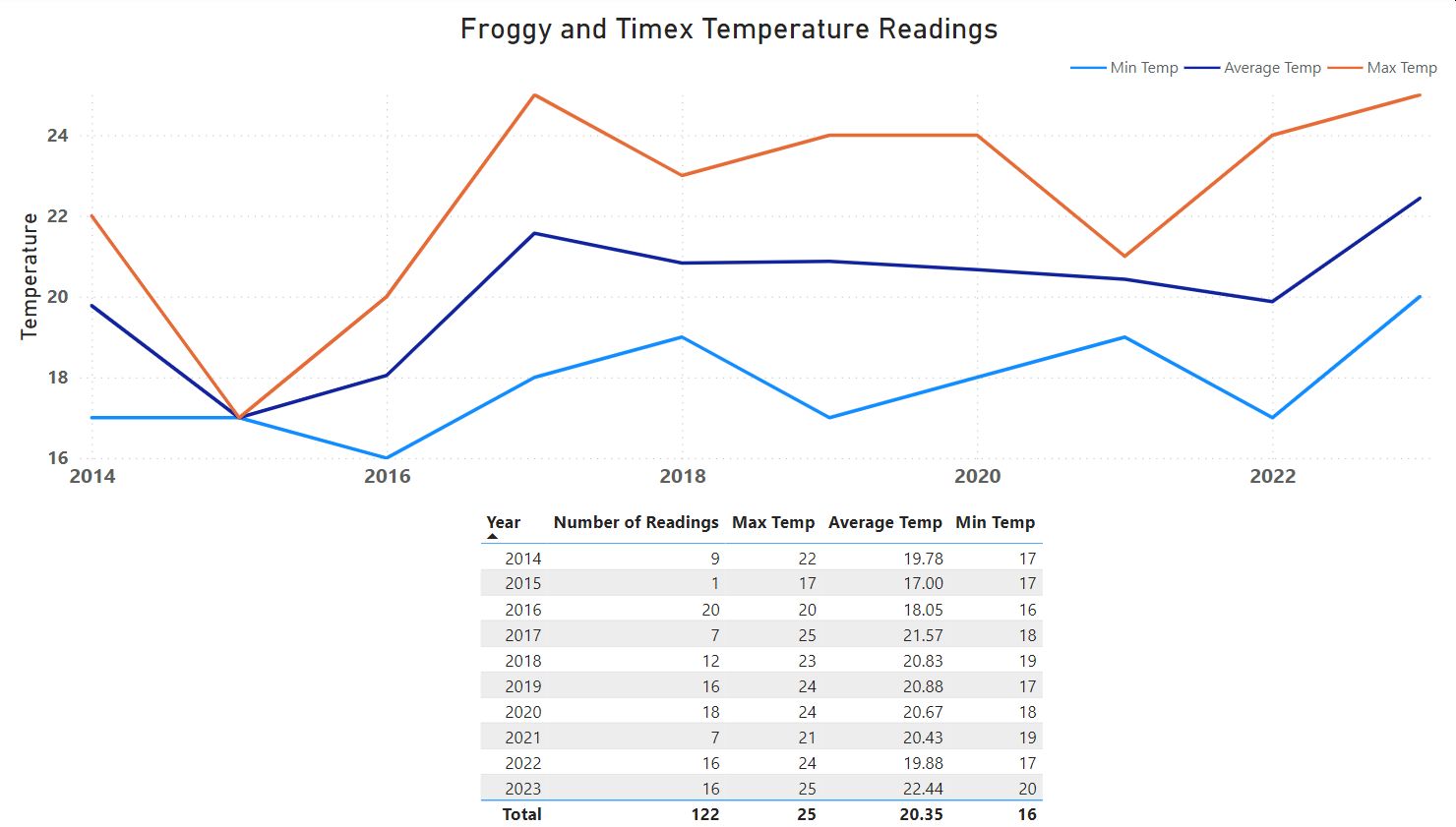
I can only assume due to the color there was a species confusion issue and I began calling the Reer 2499 “Froggy” for short and it has stuck. For this first foray into data visualization I thought it better to limit the data set to the same measurement instrument so I only included data points taken with Froggy. If we include all the data points we see a bit more of a saw blade, but also a confirmation of what it seemed like this summer: the water is warmer than normal:

Thanks for reading and feel free to give feedback or comments via email (andrew@jupiterstation.net).